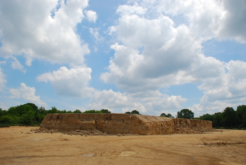
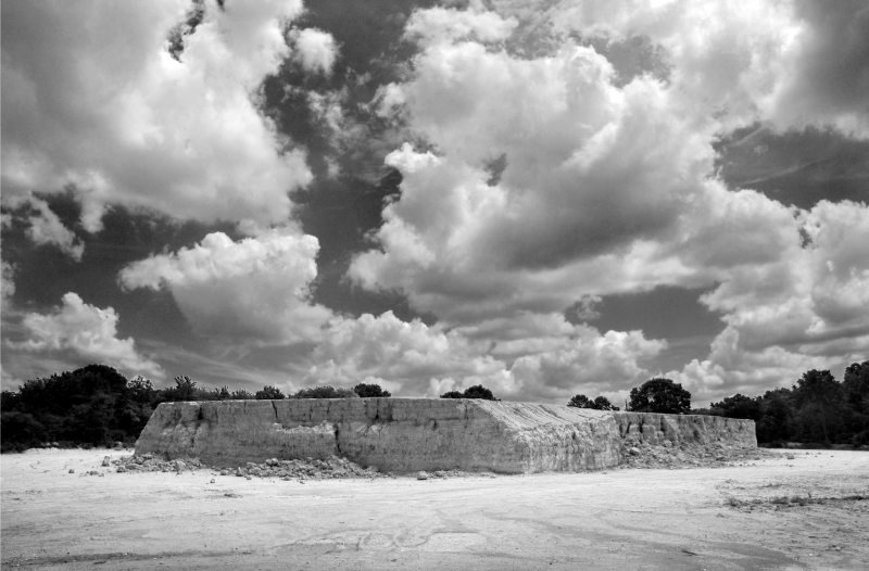
| 5 July, 2007: I shot this photo of a mound of clay last week out by Fort Benning. I thought that with the interesting clouds and the stark look of the mound with the trees behind it, the scene might make an interesting black and white print. Most folks who want a digital black and white print just use Photoshop's "desaturate" command to remove the color, then proceed with the usual darkroom-style tools (contrast manipulation, i.e., paper grades, plus burning and dodging). A far more versatile solution is the channel mixer, which is the Photoshop equivalent of using colored filters with black and white film... but since you are doing it to a color image in software rather than in the camera, you see the results immediately and have more freedom to experiment. The problem is, it can be a confusing at first... little tiny adjustments sometimes make huge differences, and unless you know a lot about color theory, or even if you do, it seems like much of it still ends up being trial and error. But it's a lot of fun, sort of a puzzle with no single correct answer (kind of like when your wife has you moving the furniture around...). Tweaking four sliders (red, green, blue, and constant) until you both get the effect you want and do not go so far that you lose detail in critical areas. Below are the results of proceeding both ways. Desaturate is first, followed by channel mixer. |
| 1: Original shot in
color: |
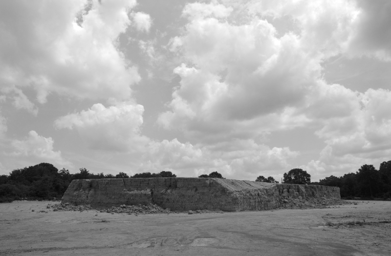
| 2: First I straightened
the image a bit, then used the "desaturate" command in Photoshop to
convert it to B&W. Desaturate adds the Red, Green and Blue channels
together then removes all chroma. The mix is not equal tho,
Photoshop mixes them in a way that is supposed to approximate B&W
film with no filtration. It's 40% R, 40% G, 20% B. This doesn't
make sense to me... I always thought that both the eye and
panchromatic film were most sensitive to green. Maybe the reason
that Photoshop biases the channels this way is because with most
digital cameras, the blue channel has the most noise and this is
their way of getting a sharper image. Whatever the reason, you can
see the image is pretty dull looking... the color contrast of red
clay, blue sky and green trees that differentiated the shapes in the
original color image is pretty much gone and everything has
flattened out. Cloud contrast is poor because the eye can pull white
clouds off of light blue far more easily than it can white clouds
off of light grey. |
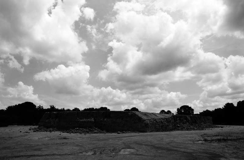
| 3. Here, I did just what I would have done in the darkroom... I moved up to a higher contrast paper (and adjusted the exposure) to get the clouds to pop. Of course everything else is now too dark.
|
| 4. So I tried to fix it, just like I would have in the darkroom, by dodging the bottom part of the print. I got the clay mound back and some of the detail in the trees on the left, but I should have done more with the trees on the right. All in all, not a bad print... if I had been doing this in the darkroom, I probably would have stopped here. Well, if I REALLY liked the image, I might have gone one step further if I had been working with Multigrade filters instead of discreet paper grades... I might have tried dodging the bottom completely, then switch filters, and dodge the top, so that the two parts of the image would have different contrast maps. I was usually too lazy to do that tho... it's too damned hard to get the transition area in the middle to look natural and I probably would have run thru six sheets of paper and over an hour to get it right.
|
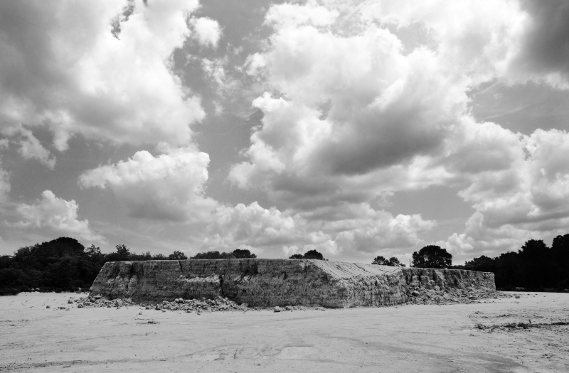
| 5. Next comes the fun part... I started playing with the channel mixer instead of the desaturate command. This can have a far more profound effect on the image, beyond what you would probably be able to do in the darkroom. This is more akin to what you'd get when you start playing with filters on the camera. In this case, I altered the standard +40, +40, +20 pretty radically to +141, +57, -61... which gives a grand total of 135 so I moved the constant slider to -35 to compensate. The clouds look a lot stronger than they do in the original color photo, but I liked it a lot since it conveyed some of the richness that I remember seeing when I took the photo. Whether this is something my eye saw that the camera didn't or whether my mind over-romanticised the image, or whether I just liked that particular B&W interpretation better, I don't know... but I knew right off I liked it better than #4 so I decided to work with it. The thing I didn't care for was that I was losing a lot of detail in the trees, and also the clay mound and the ground in front of the camera was getting too dark... it was losing that sense of bright midday sun that I remember from the scene. So it all needed to be lighter, but it needed to keep as much noon contrast as possible.
|
| 6. Since the clay had a lot of red in it, I pushed the red slider up, then played with the other two sliders to return the clouds to where they were in #5, tweaking the constant slider after each move to keep everything trimmed at 100%. I finally ended up with +161, +32, -83 (and -13 on the constant slider). This image had me inching forward in my chair because for once the adjustment did exactly what I wanted it to... the clouds stayed the same and the ground got lighter, all done globally with no burning or dodging or masking. I got a great deal of detail back in the trees on the left too, tho the ones on the right stayed dark.
7. Since the image was pretty close to what I wanted, I just did a couple of final tweaks here and there... I dodged the trees on the right and burned the ones on the left so they both had some detail and both were roughly equal in brightness. I also burned very gently in the lower corners and a bit along the bottom edge to vignette the image, thereby encouraging the eye to move upward to the center of the image.
|